redrob41

RoR Staff
  • Content Count

    158
  • Joined

  • Last visited

  • Days Won

    13

Everything posted by redrob41

  1. I don't know how you figured that, because I'm just a user of the tools, I don't know how to make them . I might try a little guerrilla style hex editing now and then, but it's all hit or miss, paired with blind luck. When I test things, it's always on the user side, and I hope that my experiments can help someone else (more qualified than me) on the programming side. I wish you guys the best of luck , and I'll keep hoping that someday there will be a set of tools that allow me to make significant changes to models, while retaining smooth model seams, accurate shadows, and to correctly use bump maps (Curse you male Twi'lek head )
  2. what other Steam mods are you subscribed to? Which folder did you install this mod to? I'm not an expert with mods on Steam, but from what I understand, if you have multiple subscribed mods, you might end up with multiple Override folders, and each one could have it's own copy of a 2da file (but the game can only use one, it doesn't merge them). Here is some good advice from DarthParametric
  3. The great thing about Photoshop is that there is a hundred different ways to accomplish the same task. Here is another way of adding shadows, but a bit more advanced: Step 1: create a New Effect Layer (step 6 above) and make a layer mask of the area you want to work on by using the selection tools. Step 2: copy the entire background layer, move the new layer (background copy) above the Effects layer. Desaturate the layer, and change the Blend Mode to “Overlay”. (these methods were all covered in the post above) Step 3: Create a “Clipping Mask”. What this does is makes the current layer visible ONLY in the same places that the layer below it is visible. In our case, the layer mask on the New Effect Layer is what controls the transparency of both these layers. I’ve condensed these three steps into one image: Here is the result of the clipping mask. Note that the thumbnail now has a little arrow pointing down at the layer below it (the layer that it is clipped to). Step 4: Adjust the Levels. This time though, I used an Adjustment Layer. A box will pop up where you can change the name of the Adjustment Layer, and where you can choose to use the layer below it as a Clipping Mask. Using the Levels box is the same as before. The difference, however, is that it will affect all the layers that it is clipped to (in this case, both the Background Copy and the New Effect Layer). The advantage of using a layer for your adjustments is that any changes you make can be undone at any time. You can also go back into the Levels dialog box and make more adjustments at any time (just double click on the layer thumbnail). You can mask parts of the adjustment layer by clicking on the Mask thumbnail (then painting or erasing).
  4. This is a Tutorial I made back in the day for Lucas Forums. I have copied it here for new modders. This is how I maintain shadows in newly textured areas: Step 1: Open the file you want to work on (in this case P_BastilaBB01.tga). I usually save it right away as a Photoshop file, and rename it. Step 2: use the selection tools to outline the area you want to work on (see the dashed outline in the image above). Then create a new layer (for now it is called Layer 1 by default). Step 3: desaturate the new layer. This will make the layer appear as greyscale. Step 4: set layer 1’s Blend Mode to “Overlay”. This will make Layer 1 affect the layer directly below it. Now, the shadow areas will cause the layer below to become darker (aka “multiply”), and the highlight areas will cause the layer below to become lighter (aka “screen”). The closer to middle grey on this layer, the less the layer below is affected. Step 5: in order to increase the contrast, I usually use the Levels adjustment, so that I have a little more control. On the histogram in the middle, there are three sliders that control the Input Levels. By sliding the black one to the right, all the dark areas become darker. Sliding the white one to the left makes all the light areas whiter. When you slide the grey one to the left, more contrast. Slide it to the right, less contrast. Step 6: create any new texture you want on a new layer (in this case, a simple render clouds filter followed by the water paper filter). On its own, it looks fairly flat and lifeless. (I’ve also turned Layer 1 off for now.) Step 7: select the blank area of Layer 1. With this area selected, make Layer 2 active again. Then create a "Layer Mask". A layer mask controls layer transparency. Here you can see the layer mask as a little black & white picture next to the layer thumbnail. Basically, the white areas are 100% opaque (100% visible). The black areas are 0% opaque (0% visible). Any greys will be partially transparent. (Advanced: you can edit the mask by clicking on its thumbnail, and painting with white, or erasing with black.) Step 8: now that layer 1 is turned back on (renamed to Highlights & Shadows Layer) it will cause layer 2 (renamed to New Effect Layer) to have a little more three dimensionality instead of being relatively flat. Step 9: if the highlights and shadows seem too harsh or contrast, they can be readjusted using Levels again. Here, the bottom two sliders are used, and they change the Output Levels. As the black slider moves to the right, all the dark areas of the layer become more grey (lighter). Similarly, as the white slider moves to the left, all the white areas of the layer also become more grey (darker).
  5. that underwear skin is just a re-color of one of my textures for Atinah, a Zeltron party member created for Revenge of Revan mod. I have NOT given any permissions for anyone to use that texture for any other mod.
  6. I have re-uploaded the 7zip file, and it seems to be downloading correctly again (at least it did for me). I've updated the K1R compatibility to "Yes". There was also the interesting effect of the images re-arranging themselves (still not in the correct order, but better than it was before).
  7. Here is the e-mail conversation that I've had with one of their Community Managers (I've removed names and color coded them): So far, I've found their help to be polite and timely. I've been trying out the site, and it seems easy enough to modify the file pages. The FileFront Review texts (by Shem, Jonathan7, et al) seem to have been saved as part of the mod description, and are fully editable by the owner. I've since re-arranged the text so that my description of the mod comes first, then the review, but I'll try contacting the reviewers through Lucas Forums so that I can ask if they want me to remove the text altogether. That would be a shame, since their reviews were one of my favourite parts of submitting to FileFront back in the day. This, of course, doesn't address the FileFront review text that is part of mod that hasn't yet been claimed by the original modder (whether due to inactivity or they don't know yet that this has all happened). One thing that I really enjoy about the Nexus site, is that I can easily add more images and change their order. That's something that I've always had trouble with on DeadlyStream, because no matter what order I've uploaded images, they never come out in the order that I want them. Oh well. All-in-all, I think that I'm going to continue to host my mods there, as well as here. The only thing is, I'm going to have to upload some of my newest mods, since it seems that the ones I uploaded to FileFront after Break Media took over are missing. I don't think it'll be a hassle (I've still got all the files), but I won't have any of the awesome FileFront reviews.
  8. Thanks to Sith Holocron for adding the images to this page (The site where I originally had them has since gone from free to a pay site, so all my links are gone). Now everyone can see Juhani in all her cat like glory. My favourite has always been the tiger, because of how she blends in with the dry grass of her sanctuary. I still think that Quanon's red outfit for her is one of the best I've ever seen and the detail on his saber hilts is always fantastic.
  9. I only just found out about this today. So far I've only found some of my K1 mods that were uploaded to FileFront before Break media took over. All of my mods that were uploaded after Break were always hard to view the web pages for (I constantly had to refresh the page until it loaded), so I assumed that they were hosted on a different set of servers. This could be why some of my mods are now on Nexus, but not all of them (so far). I've never used Nexus mods before (uploading or downloading) even though I've had and account there since 2010 (apparently). I've just sent an e-mail to claim my mods and I haven't asked that they be taken down just yet. I miss having FileFront host my mods, so I'm going to give Nexus a chance. The way they handled this might not have been ideal, since I need to know where my mods are being hosted (in order to post updates) and I only found out about this by luck. At first if feels like they have taken control away from me (by just going ahead and hosting without a modders' knowledge or choice), but if I can gain that control back and claim them, then it might be worthwhile. I can certainly understand how it stings of violation, by them taking without asking. I'll wait for them to reply to my e-mail.
  10. This looks like really good work so far, and I'm glad that you're getting some good advice from everyone. Keep it up One thing that I would keep in mind when doing animations, is that if all the panels and blinky lights are mapped to the same flipbook tga and controlled by the same .txi commands, then they are all going to loop at the same rate. This could end up looking weird, so I'd suggest that you try to do different things with each panel. For one of the Aurabesh panels, you could have it scroll infinitely top to bottom while the other one types out text, then clears the screen. I wouldn't animate your Right hand touch keypad too much, since no one is touching it, it should look almost static. I actually wouldn't do this because it would be too obvious when the loop starts over. Instead, I'd make each frame have different, random buttons light up, and sometimes one light wouldn't change from one frame to the next. That way when the animation loops, it will be harder to see. I would also try to have the left and right versions of this start on different frames (for example, if you use 9 frames, left starts on frame 1 of 9 while right starts on 4 of 9). Kind of like this: I'm guessing that you can open up one of the droids (like T3) and look at the main circular "voice box lens" mesh and see how that's made into a glowing light. I don't know how to apply materials in blender (nor in 3DS max for that matter), so I usually end up exporting it, and text editing the ascii file like you say. Then we will all be like this:
  11. I've been looking at the actual texture files, and I take back the comments of the Cinnagaran. Your use of embossing looks appropriate, especially next to all the fine grit and surface texture detail you have used. I think the "cheap, vacuum formed plastic" look can be chalked up to the rendering. Those are some nice metal filters and you certainly get reflective lighting to look authentic on the cylindrical surfaces. I wish I had your skill at doing item textures from scratch like this (my stuff is usually deft manipulation of existing game assets; I'm an editor, not really a painter). You deserve a hearty pat on the back my friend
  12. Superb work SS. Top notch. I don't think that I could pick a favourite, but some of the things that stand out for me are; the handle of the Blaster Pistol, because it looks like it has a pivot point so that the handle can fold; the off hand vertical grips of the Blaster Carbine & Sith War Carbine; the off hand grip (under the barrel) of Jurgan Kalta's Assault Rifle and the Blaster Rifle; the recessed glass in the scope of the Sith Sniper Rifle; the barrel venting and grip of the Baragwin Assault Rifle; the overall design, highlights & shadows of both the Ion Blaster and Verpine Prototype Ion Blaster. The only things that I find distracting are the odd shadows across the disc of the sonic weapons. I'm guessing that it's due to rendering and not actually part of the texture? Another thing is that sometimes the use of embossing makes the details look a little cheap, like vacuum formed plastic. They're too smooth. An example would be on the Cinnagaran Carbine (the circles on the side of the scope, and the rectangles on the side boxes). Then again, maybe that's intentional, to make them look like mass manufactured weapons. Overall, it looks like an excellent mod
  13. I just had a quick peek at all the images (sorry, I'm at work, and don't have time to read everything). Looking good so far. One suggestion that I can make: when uv mapping the goggles that have lenses, if you include a glossy highlight, it should be coming from the same direction on both eye pieces. For example, your red lenses on the ocular enhancer have shiny highlights on the outside of the lenses, which suggests two different light sources hitting each lens. Most of the models & textures that I deal with (heads) have the eyes with the highlight directly overhead. That way, the developers could mirror the textures, and still look believable. Anyway, keep up the good work
  14. I can see why it would be easier to group them that way from a programming perspective. However, when I'm testing a model I'm thinking "can this body model bend over to pick something up? How does the mesh warp when it turns it's head?" not how complex an animation it is. Maybe the groups can be something like this: 1) Tasks -Performing Actions (Activate, Equip from Belt, Inject, Pick Up from Ground, Pick Up from Table, Unlock Container, Unlock Door, Use Computer, Use Item on Other, search body, Set/Disable mines, etc) -Reactions ( 2) Combat -Attacks -Melee Weapons -Empty Hand -Ranged Weapons -Reactions (blocks/defence, getting hit, injured, stunned, etc) -Dead [...] 3) Force Powers -Casting (Cast 1, 2, 3, Crush, Persuade, Rage) -Reactions (Crush (victim), Choke, Fear, Horror, Paralyzed, sleep (standing), Spasm, whirlwind, flying back, etc) 4) Personality/Emotions -Greegings [...] (Bow, Greeting, Salute, Point, Shrug, Taunt, Touch Heart, Victory) -Looking [...] (Look Left, Look Right, Nod Yes, Nod No, Roll Eyes, Scanning, Scratch Head, Yawn) -Sitting/Meditating/Keel/Worship (and varients) -Alignment [...] -Idle and Dialogue [...] -Party member specific 5) Creature/Droid Maybe you could include a letter next to each name: F = Fire and Forget L = Looping C = Complex That way you can have a F and a L variation of the same animation next to each other in a list (like with Use Computer).
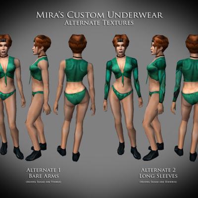
  15. Hey JC, I use the Rorschach Test quite a bit, because I need to see how my re-models are working with different animations. I was hoping that you'd be able to re-arrange how they are organized. Instead of [Fire and Forget] [Looping] and [Complex] would you be able to arrange them by the type of action, maybe based on the HUDs? What I mean is, the lower left HUD has Actions (passive force powers, stims, place mines, etc), while the pop up HUD has attacks, grenades, aggressive force powers or actions (unlock boxes, use computer, disable mines, etc). Under each of those trees, there could be sub menus for actions taken by the character vs reactions (like being choked or damaged). Also, I can't find any of the combat animations in there. I usually have to run around and find some poor creature to beat up
  16. Then the default texture is embedded in the mdl, and you'll have to edit it. I believe that MDLOps has a renamer function, but I still do things manually (old school) by using a hex editor. First off, when you run your model through MDLOps and it gives you a -ascii version, it should also provide you with a .txt file. If you open that with note pad, it should contain the names of any textures that the model requires (these are the default textures). Normally there is just one texture, but there can be multiples. Theoretically, you can have one for each separate mesh (head, L eye, R eye, L eyelid, etc). I'm at work, so I don't have any access to the actual files, so I might get the names wrong. I'm guessing that you took "twilek_m01.mdl" and re-named it to "maxishead01.mdl"? When I re-name model and texture files, I always keep the number of text character spaces the same: twilek_m01 has 10 spaces while maxishead01 has 11. When you rename the texture, it MUST have the same number of spaces, because when you hex edit it (or use the renamer) if the name is too long or too short, then it shifts all the byte code out of alignment, and the mdl won't match the mdx, which causes the model to fail in-game. Anyway, once you get the name sorted out, here's what I do: (I'm going to use "twilekRR41" as an example). 1 - use MDLOps to extract twilek_m01.mdl, twilek_m01.mdx, & twilek_m01.tga 2 - rename the files to twilekRR41.mdl, twilekRR41.mdx, & twilekRR41.tga 3 - Open "twilekRR41.mdl" with a free hex editor (I can't remember the name of the one I use at home). 4 - use a find and replace: find "twilek_m01" and replace with "twilekRR41" - save 5 - Then do all the steps with heads.2da that were mentioned by Fair Strides Again, I'm not on my Kotor computer. If I've got the names wrong, I'll have to fix it later.
  17. Which game are you making this mod for? When it comes to heads.2da, there are actually different steps to take for each game. In Kotor, the default texture name is only embedded in the mdl file. In TSL, while the name is embedded in the mdl, there is an extra column in heads.2da that allows for another texture to override the default.
  18. What I was able to do was take the Traya and the Kreia menu models: 1 - convert to -ascii.mdl with MDLOps (5? it was a while ago) 2 - load it into 3DS Max and then manipulate the mesh vertices and uvw map, export it 3 - use Taina's replacer tool to modify the original mdl & mdx (there should be lots of threads or tutorials, just search for Taina and replacer) 4 - the new model worked in game just fine Logan23 made a re-skin of the Sion menu model, but I eventually re-did that character from scratch, so we didn't need the Sion re-skin. So far, I haven't tried to add the new character to any menu model.
  19. I've got a red head in one of my mods... http://deadlystream.com/forum/files/file/490-ror-playable-humans-for-tsl/ The fourth Caucasian female has red hair and freckles, but she's not quite as bright red as your avatar KK (which I always find myself staring at, waiting for the wink ). One of the males has reddish brown hair too.
  20. redrob41

    MDLOps

    That's the standard PFBAM mdl, but heavily modified to match Mira's BB model almost perfectly (like the pronounced clavicles). My previous underwear mod was good, this one will be better. That's good to know. I'll keep it in mind as a last resort, since it would mean a whole bunch of extra work to re-weight the shirtless male & Mira undies models. If MDLops is tweaked to work the smooth groups better, then they would be ready now (I still have to re-do her dancer model before releasing it).
  21. redrob41

    MDLOps

    sure, I could do that. And I could delete the mesh where the neck hole would be. As long as there remains the same Torso, Larm, Rarm configuration that all the body mdls are set up for, it could be a decent work around. But there are times when you want different smooth groups on the same mesh (like the shoes), but they can't be detached into their own object. Afaik, the game engine isn't set up for that (it expects Torso, Larm, Rarm). Of course, I could be completely wrong (I know next to nothing about game engines ). If MDLops can make use of smooth groups and calculate normals across mesh seams, that'd be more useful in the long run.
  22. redrob41

    MDLOps

    I checked a few verts around this seam: As shown, X=-22.522cm Y=-4.118cm Z=132.47cm and the matching vert on the Larm had the same coordinates. and I made the smooth groups the same for the skin of the shoulder (Torso object) and arm (Larm object):
  23. redrob41

    MDLOps

    Ok, now that I've downloaded 0.7a2, I'll start posting some of my experiaments. I've been holding off so far, so that FS could have a bit of a break. I hadn't seen that there were no shadows when I was doing my testing, because I usually have them turned off. Plus, for testing, I've made the Dantooine ground transparent, and the skybox is 128 Grey. That way, I don't have to work so hard with Photoshop to separate foreground from background. Anyway... http://deadlystream.com/forum/gallery/image/449-mira-test-mdlops-7/ In the image for Mira's underwear, I've got in-game shots of her with various mdls. - The one using Taina's replacer has smooth edges, but no shirt tie, and some of the vertices are weighted strangely (by default). - Using MDLOps 0.6 you can see the hard edges (the back of the arms is the worst, but no screen shot), but at least the shirt ties work, and the weighting issues have been fixed (at least the ones that bothered me the most). - Using MDLops 0.7a1 or a2 (only difference was the shadows) you can see that the edges are smooth along the wrist, fingers, inside leg, trapezius, but there is a hard edge below the deltoid / above the bicep. This is where the Larm/Rarm mesh object meets the Torso mesh object. I've checked a pair of verts, and they seem to be identical between Larm and Torso. Those faces were all set to the same smooth group. http://deadlystream.com/forum/gallery/image/450-male-underwear-test/ - Using Taina's replacer, the model retains the original smooth groups. This results in smooth edges at the seams, but there's a noticible semi circle around the collar (this is where the vanilla DS skin has red cloth). This is th model that is included in my underwear mod. - Using MDLops 0.7 fixes edges and removes any different smooth groups. I found that it didn't matter if I compiled the binary mdl straight from the unedited ascii.mdl or after I'd edited it in 3ds max 2011. It seems to me that mdlops is swithcing all faces to the same smooth group before calculating normals. The downside, is that the faces on top of the neck (where the head mdl sits) needs to be a different smooth group than the rest of the body. If they are the same smooth group, then it tried to round the edge, and thus it puts a highlight around the neck, rather than a shadow on one side (like the Taina model). - Also, you can see the hard edge where the arms and torso meet when using 0.7a So, I think that the new mdlops still isn't perfect (hence alpha). Hopefully, my testing can help out. As a side note, when I was checking for shadows, I noticed that Mira's head didn't cast a shadow when in her undies or when wearing armor. Her head did cast a shadow when wearing her default clothes (I think that her body model includes bones for the head, but the other body models don't).
  24. redrob41

    RedRob41's Test images

    various images of WIP or tests