-
Content Count
1,554 -
Joined
-
Last visited
-
Days Won
46
Content Type
Profiles
Forums
Blogs
Forum & Tracker Requests
Downloads
Gallery
Store
Calendar
Everything posted by Malkior
-
Testing Screen Space Ray Traced Global Illumination on Kotor
Malkior replied to AndreySer's topic in Work In Progress
Ironically, I was just in a long drawn out argument/discussion with someone specifically about Ambient Occlusion, so I had to do a bit of research on the topic. It turns out that shader AO or at least Screen Space AO has that problem with darkening the image too much due to its technical limitations. Quite interesting to be having so many conversations about these graphical advancements with Reshade when only a few years ago we could only change the colors and contrast. -
From the album: Tests
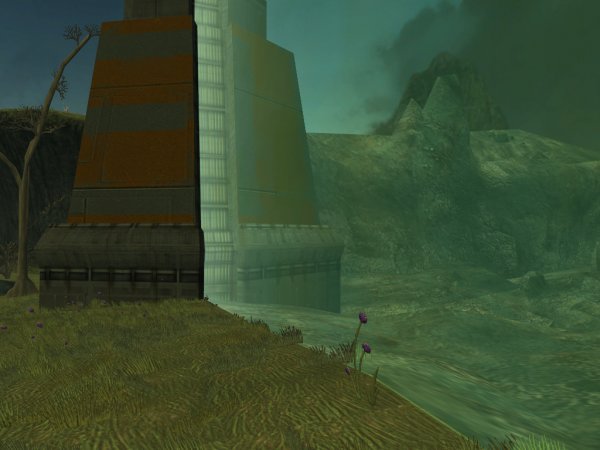
Just a shot against the environment shield with all of the elements together. I am considering updating the rock texture of the battle ravaged area behind the shield just because it looks quite bad. -
From the album: Tests
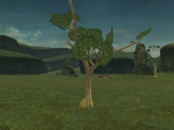
One of the trees isolated to hopefully show the textured model in its entirety. Originally I was going to make the bark a darker color, but the lighter tones seems to work better against the canyon wall. -
From the album: Tests
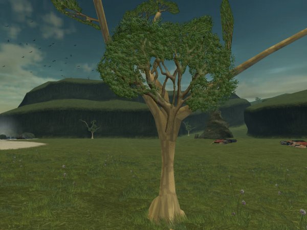
Some details on the trunk base of the trees. This area is the little visited stream toward the back of the module complete with hiker skeletons and backpacks. -
From the album: Tests
Some shots of the new tree bark texture I just finished tonight. There are still a few seams and abnormalities, but I will be fixing them as I see them. The model itself isn't something I can fix myself, so for the moment, I'm just focusing on sprucing up the textures. -

Testing Screen Space Ray Traced Global Illumination on Kotor
Malkior replied to AndreySer's topic in Work In Progress
I am definitely seeing a lot of potential with this as well. The effect makes the visuals a bit darker than I think the game designers intended, though. Perhaps running a Tonemap shader and boosting the gamma would help? Alternatively, you could edit the Lightmaps to increase the brightness and/or add color to better take advantage of the Ray Tracing effect. Just some thoughts.. -
Since a few people have been asking about AI recently, I'm reminded of a problem I've had regarding combat in general with Kotor and Kotor 2. Regardless of whether you're controlling or not controlling a character, whenever the combat is activated, they invariably use the weakest attack possible by default (The single sword icon). I know that some mods make it so that in the midst of combat or at least after the first round, companion AI is actually quite good at generally finding the ideal attack for a given situation. However, no matter how good a mod is, the characters always start the battle with the same default weak attack. At this point, I assume this is technically a bug not unlike the issue where ranged player characters rush the enemy as if they're holding a melee weapon because the combat system probably starts with the unarmed strike at the beginning and if you have no weapon, you will just stand there to get shot by ranged enemies. Unfortunately, I don't really know the AI code that well. The only psuedo explanation I have is that this is to keep the player from getting stuck when combat is initiated at which point follow up combat functions determine which attacks to use. However, this is really freaking annoying since sometimes I like to open a round of combat with a grenade volley and my character happens to be carrying a sword; and I don't want him to be running headlong into certain death rather than just blowing it up. So, I was wondering if the grand scripting wizards of the DS could conjure a reasonable workaround or alternative code to address this issue so I don't have to babysit my characters (Cancel the default attack, empty each additional default attack they want to use, then choose the attack I want to start with and hope they haven't already started their kamikaze run sometimes leading to them running in circles as they figure whether to ignore my command) every time I start a round of combat.
-
From the album: Tests
A little update, but there's still so much more to do.. -
At this point I feel like Star Wars is a car I used to love and still do, but I had to sell that car, and I have to let the new owner do whatever they want with it. So rather than stress over what stupid senseless thing they do to it, I can still remember the good times I had with it. In other words, there is nothing we can do since they own it and technically have every right to drive it into the ground on fire while everyone fights over whatever is left. A bit bleak, perhaps, but that is the reality we live in. Alternatively, we can hope that by some chance there are enough fans of actual skilled writing left (That have nothing to do with pointless love triangles, obscure prophesies, or Mary Sues jammed in for no reason; seriously, do these guys even realize how much Horrible Writing Advice has them pegged?) can create something unique and genuinely fun to watch and play. Maybe anomalies like Mandalorian and Jedi Fallen Order can fall through the cracks.
-
I was just thinking of how hilarious it would be if someone said something like, "Man, Visquis is looking AMAZING today!".
-
A Falleen might be kind of strange from a story perspective since they use strong pheremones to influence business dealings. Then again, that also might lend itself to more interesting character interactions further along the way.
-
Should be. I noticed that OTE uses an exe installer, so there's no way to be certain exactly what it does, but the mod page says that as long as the files don't have the same name then there should be no problems. Since Darker Peragus just changes the lightmaps and GIT, this should still be compatible as long as OTE doesn't edit the lightmap textures for some reason. (Which I really doubt since it seems more aimed at area textures) Even so, please let me know if you have issues.
-
From the album: Tests
Just a shot of some elements from an interesting angle. (Quite fond of the cliffs, personally) Since the Lightmaps lighten the grass more, the deeper parts become that much more pronounced. The trees are insanely bright because I haven't yet edited their model data to have less bright self-illumination. (The default setting was part of the reason they look so dark in the Vanilla game) -
From the album: Tests
Just a shot of the trees from a distance while showcasing the new lightmap brightened sand and grass. The trees each have individual lighting information on their model which is why some are neon bright compared to others. My next task after getting the tree textures up to par is to fix those model issues. -
From the album: Tests
Just a screenshot of the elements of the mod together; hopefully it's becoming more clear as to what my final goal for the visual look is to be. The Vanilla tree geometry is laughably bad, but I'm not exactly as well versed in editing the placeable meshes and would need more research into how to do so effectively. The sky is also completely Vanilla, but I plan to do something about it eventually. -
From the album: Tests
Some screenshots of my first pass at adding leaves to those bare trees. Right now the details are incredibly simplistic, but I hope they're starting to take form adequately enough. -
From the album: Tests
Some up-close detail of the branch as it stands. I used a few references of Acacia trees for the design, but it's still starting to look a bit too much like an Oak shape and may require further work. -
From the album: Tests
Hopefully this is the semi-final version of this particular texture so that I can focus on getting the trees some leaves. For the record, the "flowers" are modeled after thistle blooms; yup, giant alien thistle. -
From the album: Tests
Tweaked the lighting, doubled the resolution and added a lot more detail. More pleased with the result. -
From the album: Tests
Next iteration of the Telos Grass and Terrain. Tried to emulate a more natural color scheme, but I will probably make a side version for those who prefer more bright green grass. -
From the album: Tests
A screenshot to show the new shore and grass lightmaps with the terrain retexture I'm currently working on. The terrain is still a work in progress as it still looks a bit.. longitudinal at the moment. My goal is to make it look more like it's the lower grass when all is said and done. -
From the album: Tests
I final shot of the inland portion of the shore. I'm open to suggestions on how to improve it or to make it more realistic. At the very least, the grass and terrain blend together properly. Next up will be finally adding leaves to the Acacia trees. -
From the album: Tests
Screenshot of the valley before the shore in the Telos Restoration Zone. The lightmap edits create a good amount of visual contrast, but the animated grass doesn't take on the changes, so looks a bit odd as a result. I have not idea how once would bake the lightmaps onto the animated texture or even if it would be possible. -
From the album: Tests
Another comparison of the restored grass versus the irradiated ground behind the shield. Not much to say except I like the visual contrast. -
From the album: Tests
A screenshot of the retexture with the upper hill lighting.


