-
Posts
710 -
Joined
-
Last visited
-
Days Won
64
Content Type
Profiles
Forums
Blogs
Forum & Tracker Requests
Downloads
Gallery
Store
Events
Everything posted by Jorak Uln
-
Hey, that looks outstandingly beautiful! I especially like the sunglare - you got rid of the oversaturated red sky - and now the color scheme is finally believable and realistic. You mentioned the blue rocks (with the statues) - they are not part of the skybox, right? That means, they could be retextured like any tex as well. If so, i wouldnt change anything regarding the color scheme of your skybox. Blue rocks could be easily retextured in whatever color needed...
-
-
Yeah. It took me a while to find out which noise matches the TOR look... Thanks - thats the idea. Old Rep is full of great designs and offers lots of inspiration... [Mod Note: Merged your posts because of double-posting. There were only 8 minutes and no replies between the two posts, so please read the site rules.] Some more pics, now also from K1: Restoration Zone, new rocks: new cantina floor: Misc Pics Modules: lights: Taris tech BEFORE: AFTER: Keblas: new Towers & Skyline:
-
Rece, i appreciate the effort you put into your modding projects, but to be honest, there are some things you could improve - please dont take that as critique - but when doing textures, its most important that you try to do them as realistic as possible. That means if you making a leather armor, it should look exactly like leather - same with other materials. It often helps to get a real picture or one of graphically newer games as reference. Secondly, dont forget that it doesnt matter if the tex look flashy in Ps, much more important is the right material choice. I hope that helps you out, im looking forward to see your next creations!
-
Now here my attempt to create that typical "Bioware - Noise" - keep an eye on the floor: Bioware: modded texture: further, i did some tweaks on the "cubemap lights trick" mentioned before - i simply added a glowing corona around the transparent texture and tweaked the transparent part with a gradient - that way the shape seems slighty blurred and more realistic: with corona & gradient: brighter variant with corona:
-
and here some teaser pics for the upcoming Telos Overhaul - note that they are WIP, there are still a lot of things to change - my goal of the mod is to get a little bit away from Mass Effect back to Star Wars, orientating more on SWTOR. So give me some thoughts on them, do you like that metallic style, does it fit, what do you want to be changed etc.:
-
First drag the files from the "Manually into Override" folder into your Override folder, then download all the other files, extract them to your desktop, then install xnview and proceed like shown in the HOWtoinstall file. (this file you can also download from my other mods, the procedure is always the same. You also can watch Xuuls video on youtube, he explains everything there).
- 12 comments
-
- mass effect
- next gen
-
(and 3 more)
Tagged with:
-
na, your mods are amazing as well - i never could have found out about the custom bump maps or cube maps... ---------------------- These cube maps...are great btw. I dont know if you guys know a trick for this, but i always struggled to make custom light textures on certain objects like PLC files "shine" enough: If you watch this chair from SWTOR, you immediate notice the incredible shiny white lights on them: http://www.directupload.net/file/d/3962/ng2oe9du_jpg.htm is that an effect limited to the engine? No, not at all. When making them for TSL, i tried an experiment: i made the area where i wanted the lights transparent and assigned a completely white cubemap via txi. The following pic might not show the effect completely, but ingame its almost blending me: (its not just a white texture, ingame theres a huge difference) http://www.directupload.net/file/d/3962/myton7ws_jpg.htm In other colors you realise the difference even more...
-

My Projects In the Pipeline (mostly texture related)
Jorak Uln replied to Malkior's topic in Work In Progress
Nice to see your project continue! Personally i like your Telos and Dantooine skybox most, they really mirror the atmosphere of the planets.. Onderon look great, although the resolution seems to be a bit low. Would it be possible to turn it up? Anyway, great job and cant wait for the next one! -
Good work, Kexikus! I like Tatooine most but am exited what you will pull out for Dantooine. Are you planning to do Nar Shaddaa as well?
-
-
-
@Quanon: Wow! The malachor skybox looks amazing! It adds a lot of flair to the scenery - cant wait to see it ingame... about your animated sign: Glad there more guys doing animations - the pic looks promising - but it looks like you adding the pic sequence per hand...seriously??? Ive mentioned it a long time ago when i started modding, if you want to use animations in Kotor -> use a professional software - i work a lot with Genetica. The good thing is, you can do your textures with Photoshop or whatever and then just import the finished image into Genetica and basically make ANY animation you like. There are no limitations...
-
- 17 comments
-

SKIN:PANEL Overhaul animated (Mass Effect Edition)
Jorak Uln replied to Jorak Uln's topic in Mod Releases
New version 1.5 online! to upgrade from 1.0 just download part1 and overwrite. Pics: Version 1.0: http://www.directupload.net/file/d/3925/y7sa6fjp_jpg.htm Version 1.5: http://www.directupload.net/file/d/3925/biclsz9z_jpg.htm- 7 replies
-
- texture pack
- mass effect
-
(and 3 more)
Tagged with:
-
- 17 comments
-

SKIN:PANEL Overhaul animated (Mass Effect Edition)
Jorak Uln replied to Jorak Uln's topic in Mod Releases
it should work now. Have fun!- 7 replies
-
- texture pack
- mass effect
-
(and 3 more)
Tagged with:
-
View File PANEL Overhaul animated (Mass Effect Edition) In this overhaul all major panels, workbenches and the computer panel background are remade from the scratch and animated. I tried very hard to merge the sophisticated ME3 look with original Kotor - and used only 4k/64 pics animations/uncompressed files to get a proper look - so yes - the mod size is indeed ~500MB. To get the most out of it i suggest that you guys download Xarwarz OTE series first, then override everything with my mod. Install: Download the mod, extract it with an archive extraction program like 7zip or WinRAR, then move the extracted files to your game's override directory. Compatibility: 100% compatible with TSLRCM & M478. As pure texture replacer it should be compatible with everything else. IF you want to install Xarwarz OTE texture PLC files, then install them FIRST, then override everything with my mod. Enjoy! Submitter Jorak Uln Submitted 03/11/2015 Category Skins TSLRCM Compatible No
- 7 replies
-
- 1
-

-
- texture pack
- mass effect
-
(and 3 more)
Tagged with:
-
Version 1.6
19,056 downloads
In this overhaul all major panels, workbenches and the computer panel background are remade from the scratch and animated. I tried very hard to merge the sophisticated ME3 look with original Kotor - and used only 4k/64 pics animations/uncompressed files to get a proper look - so yes - the mod size is indeed ~500MB. To get the most out of it i suggest that you guys download Xarwarz OTE series first, then override everything with my mod. Install: Download the mod, extract it with an archive extraction program like 7zip or WinRAR, then move the extracted files to your game's override directory. Compatibility: 100% compatible with TSLRCM & M478. As pure texture replacer it should be compatible with everything else. IF you want to install Xarwarz OTE texture PLC files, then install them FIRST, then override everything with my mod. Enjoy!- 17 comments
- 14 reviews
-
- 1
-

-
Sapiens, that sounds like an excellent idea. I'm really looking forward to it! Allow me to tell you some thoughts on your pics: Especially the Duros skin and the Sion texture are very detailed and look really stunning! Something that could use a bit of work are the eyes though - the pupil should be definitely smaller and if its possible - imagine them with some 3D depth... like here: http://oi43.tinypic.com/mtrpe.jpg http://www.zeiss.co.uk/content/vision/great-britain/website/en_gb/desktop/better-vision/better-vision-with-zeiss/for-your-eyes-only/jcr%3Acontent/stagepar/stage/slide/stageimage/image.img.jpg/1361258713159.jpg/zeiss-uk-eyes-visual-980x308.jpg Aside from that its marvellous work - keep it up!
-
@Malkior: The "phone" panel i have done earlier in this thread, however im not fully convinced yet how the armatures turned out... The tricky thing with this texture is that its mirrored .. --------------------------- Beside that, guys heres my take on the vanilla galaxy map & the generic computer "screen" menu, which always was a immersion killer for me, since it doesnt give you the feeling of entering a computer screen at all. Pics of vanilla computer screen: http://www.directupload.net/file/d/3880/ef3eesqp_jpg.htm Vanilla galaxy: http://www.directupload.net/file/d/3880/yb7pn3sh_jpg.htm My take on it: And heres something special - recognize that pic? http://www.directupload.net/file/d/3880/dhgv5e4l_jpg.htm to realise it in TSL, i used Sapiens Cubemap ressource pack - which btw is one of the best things ever happened to Kotor - to get rid of the baremetal glow:
-
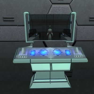
When making textures i feel its always the question vanilla vs non vanilla. Which one to choose?? On a personal point of view Display textures always have to mirror the technical standard of the world - and importantly, tell the NPC/player informations. So if you see the Taris swoop moderator in front of the terminal telling the news and staring at some undefinable pink/blue whatever color-cluster thats not very immersive, is it? Especially when it happens in a cutscene... If i (or any other retexturer) do a 100% vanilla retexture on a display, its maybe looking crisp - but you still feel "here are no informations to get"... So the question remains: How far can i go? With that in mind i made the two following PLC files: (for the details please turn it to HD) Long time ago i was trying myself on PLC_desk1 and the Panels files - now with more experience under the belt i gave it a shot and made the wall panel strictly in vanilla style: On the other hand i tried to display the full array of next-gen-ness with multiple animations/transitions at the desk1: Which style is it?
-
hey thanks very much! Thats nice to hear! Well, my "rolemodel" is Mass Effect 3. Dont know if you own it (probably i guess), its full of masterly executed animations especially the dlcs, in my opinion one of the main factor why its such a fantastic game. Ebon Hawk displays are one of the difficult ones bc i have to think about the background walls - i probably will do them in context with the Coop project with Xarwarz. When hes finished the walls its best. Btw yeah, also like your sig. But the old one "cant possibly comment" was more serious, but fitting too....
-
Curiously a few month ago i indeed sent a PM to FairStrides about that mod - and he said there were too many unexpected difficulties to overcome - maybe with the finish of K1R he finally found time for it... Anyway, thread relevant formalities are not my responsibility so its best if you guys PM each other..
-
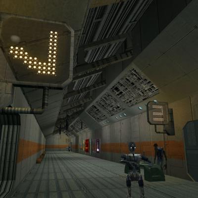
here are some of my animations for the project: Sith Base Logo Screen: my attempt on a "Newsnet" at Taris Upper City:


