-
Posts
31 -
Joined
-
Last visited
-
Days Won
3
Nomnisang last won the day on February 28 2017
Nomnisang had the most liked content!
About Nomnisang
- Birthday 07/06/1988
Profile Information
-
Gender
Male
-
Location
North Yankton
Recent Profile Visitors
5,085 profile views
Nomnisang's Achievements
Scout (1/15)
23
Reputation
-
Sith Holocron started following Nomnisang
-
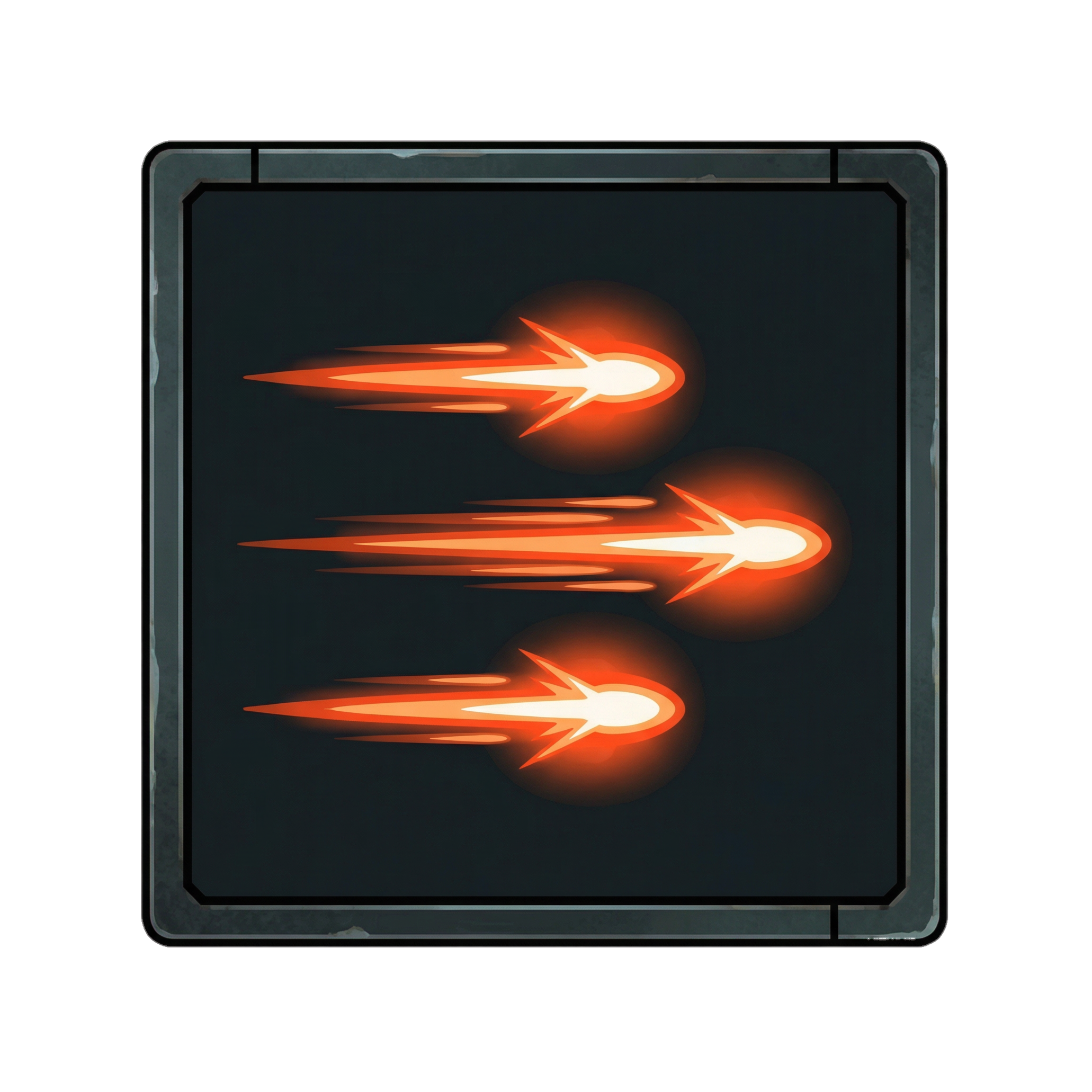
Hi, woah! Sorry for the delay. The short story is I was in process to get promoted at my job, so I worked my butt off and got it. Since then, my work load has increased, so I haven't made time for side projects. What does this mean for the project: In the last several months, I've spent most of my photoshop time screwing around. I have kept the project in the back of my mind, and plan to continue. While my professional life will continue to be busy through the holidays, my off-time will be getting more consistent. For anyone who is curious, here's a list of the current icon set that I plan to produce. Everything highlighted in green has a completed design. If anyone has an opinion on icons that should be added or removed from this list, please let me know. These are all icons that end up on the main gameplay screen, and include powers that I expect players to use the most. I'd like to start making more dramatic updates in the future, meaning I don't plan to post each icon as I complete it. Expect posts in the future to include multiple skill trees or mile stones.
-
Great work!
-
There's just under 90, so it's fewer than the feats. Those also include power trees, and a bunch of them are assets with an arrow added. That said, I should probably sit down and figure out how many of these I have left to produce. I've just finished designing Wound, but I feel like I need to rework the colors. Ultimately, I'm happy with the design. I think the silhouette I've designed is perfect for what I need.
-
Conditioning. I'm going to use what I've learned making this icon to improve the heal icon in the future. This silhouette will also be used for other similar icons as this project moves forward. As for the future of this project: I think that it's time that I start zeroing in on releasing some of these to the community. The plan from here on is to work on the icons that appear on the combat screen, rather than the menus. That means the attack icons, blaster icons and sword/saber attack icons. That also includes Attack force powers like push, wave, destroy droid and the like, as well as buff powers. I'm sure that I'm forgetting some essential icons, but I'd like prepare to release what I'm calling Suite One. If anyone can think of a category that needs to be released with the first Suite, let me know, and I'll work to include it.
-
Agreed. But I did learn a few things from messing with that.
-
I've run into a snag with the portrait transparencies. While messing around, I found that there is a layer behind it. I'm diggin' through KotOR tool to see if I can find the actual layer and mask it, but so far, the last two Sage green files that I've masked haven't been the file. I'm sincerely hoping that this isn't something with a sage green overlay over it. By the way, the mandalore image is a quick and dirty edit I made to help me find problems like these. I plan to either find much higher resolution images to sample from or to swap a green screen texture into a level and start snapping some of these.
-
Already figured out how to take care of it. The next status update will account for artifacts.
-
I actually love the idea of doing Mass Effect style character transparencies. What I could also do is have a fog transparency of red or blue depending on their light or dark side level. If anyone has some high resolution icons for the party members, I'd love to sample them. Failing that, if anybody knows of a good green screen texture pack, I could drop that into Telos or something and start getting high res shots myself. One thing to note on the Character Portrait Layouts: I cheated to get the level up icon in the corner. I didn't change the code or anything. I simply took my icon and moved it to the corner of my image, rather than centered. So you have a 256x icon in the top left corner of a 1024x image that's masked off. I have no idea how I would move character portraits to the center, or move the health bar, etc. I don't have any coding experience. My experience is limited to editing values in plugins and managing permissions for a Minecraft server back in 2011. If someone can point me towards a Gui tutorial, I might be able to get started... i should also look into the layout for the buff and negative status arrows, and see about moving those to the side, or to a lower corner. As for glossy: I'm fully capable of doing something like that, but glossy tends to scream early iPhone to me. I'd much rather keep the UI matte with light gradients. Still, I'd like to start taking on the menu tab icons, as well as the equip screen icons. I might start experimenting in the not too distant future. With regard to the menu icons: Has anyone else ever been bothered by the options and settings tab having a hammer as it's icon? In most games, it's usually a wrench or a gear, but those are used for skills and feats. If you were to make KOTOR today, what kind of icon would you make it? What it'd really like to do are some more physical health and force points bars. I'm love to design them to look like tubes with water flowing through them, with bubbles floating to the top. Unfortunately, I'm really not sure how the life bars work, currently. The assets I've looked at thus far have just been lightly covered edge caps for the character portraits.
-
That was a quick and dirty edit of the original resolution. I have the original docs saved. Those white pixels are artifacts from editing the 128x128 targa files. Doing the same exact mask at ahigher resoltion and scaling it down to an appropriate size eliminates those artifacts. If you check out my level up icons, those have gradient masks and com out much more interesting. Honestly, though, if I did want to edit the teargas, I would just need to drop in a black background before masking. What's cool about this project is all the little workflow problems I'm learning to solve. I'm actually more excited about what I'm learning than about replicating the icons. At this point, I'm feeling comfortable working on the GUI.
-
This puts your character in first person, allowing you to better frame up your shot. If you do this in K2 as Visas or Kreia [or later the Exile], you'll see in grayscale with the color of a character's alignment overlaid.
-
Experimenting with GUI element's and .tga gradient masks. Also, experimenting with layout.
-
One thing I find about a lot of Sci Fi textures is that in the future, there is no concrete. I'm glad to see these arch's have a stoney texture to them. Great work!
-
That looks awesome!
-
I'll keep experimenting and see what works. Finally started messing around with alpha masks in .tga's. I've never needed to use this kind of format before. I tried dropping PNGs into the override folder, and of course the game didn't use them. So I did a quick mockup. At this point, I'm really glad I keep my original documents, because if I had to remove those individual pixels by hand I'd give up now. Truly, though, I'm happy with the results. These critical strike icons are at 256x256. I still think that 128 scales better, but that's just me. Also; to whoever it was at Bioware who decided that icons should use Targa's: Why?!?
-
I think I've made more than a reasonable number of additions to that last post. This will make it a triple post. Weapon Focus: Lightsaber
