About This File
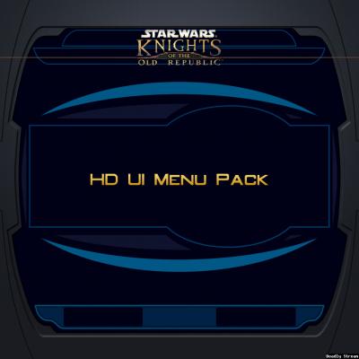
HD UI Menu Pack
for Knights of the Old Republic
v1.1 - 20180318
by ndix UR (DeadlyStream user)
This modification adds high resolution UI menu textures. 2K is the base resolution.
The content is redrawn vector art, no modified scale-ups here. It is focused on menu backgrounds, and includes some of the overlay components for the menus.
Pure Vanilla (PV) Edition aims to provide the closest match to the original menu texture assets.
This mod doesn't touch a lot of the 'extra' menu-like GUI elements yet, such as the galaxy screen, computer interfaces, pazaak, etc. It also doesn't mess with the main menu at all yet.
Requirements
You must be running menus at a high resolution for this to really work. At the default menu size, this mod will probably look bad.
You must have KotOR High Resolution Menus or an equivalent mod installed for good results.
Known Issues
The original textures were for 640x480 menus. The 4x sized textures in this package would look best at 2560x1920, which nobody really uses. If your display is less than 2560px width, you may experience seams where different textures are intended to meet seamlessly. The game just isn't that good at scaling UI textures with alpha channels used for transparency. There's nothing I can really do about it.
There are some sprites in the menu processes that haven't made it into the package yet. They may sometime.
I've added x/y clamping to some textures that should have transparent edges over 3D backgrounds. It makes the transparent edges work well, but the diffuse edges work less well. It seems you can't have it both ways, and this is the trade off.
Install / Uninstall
To install, copy the files from the package Override/ folder to the Override/ folder for your KOTOR game installation.
To uninstall, remove the TPC files for this package from your KOTOR game Override/ folder.
Legal
THIS MODIFICATION IS NOT MADE, DISTRIBUTED, OR SUPPORTED BY OBSIDIAN, OR LUCASARTS ENTERTAINMENT COMPANY LLC. ELEMENTS TM LUCASARTS ENTERTAINMENT COMPANY LLC AND/OR ITS LICENSORS.
The content of this mod is free for use and reuse, with no implied warranty, you can redistribute it, in original or modified form. If you do, a credit of some kind is nice but not required.
What's New in Version 1.1 See changelog
Released
- Added character generation quick character panel
- Added clamp semantic to reduce seams on overlays
- Dimmed frame color on quick/custom character generation panel


Recommended Comments
Join the conversation
You can post now and register later. If you have an account, sign in now to post with your account.