More Vibrant Skies 1.0

   (9 reviews)

13 Screenshots

About This File

Ever wonder how it feels to run from level to level and look at nearly every sky texture border to make sure that every pixel matches?.. I sure do now.


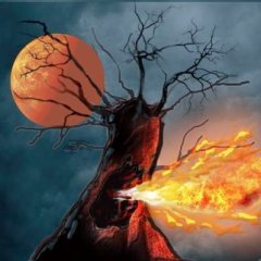
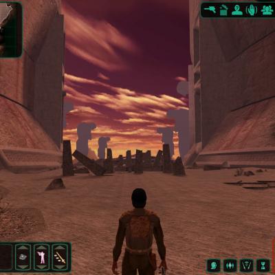
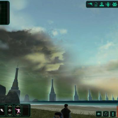
My goal was to make all of the skyboxes look more "alive" by changing certain values in photoshop to getting rid of the twilight/grey color palette that was used. The only skybox I actually repainted the entirety was dxun to make it look like the player was actually in a thunderstorm and not those grey wispy things. (there were two zones and each required their own texture)


I also provided options if you don't want the moon and/or planet on the background on Dxun and two variations on the suns of Dantooine and Telos.


(Also included is a small .txi file that makes the girders outside Telos Station more visible and less like paper mache`)


Hopefully they make Kotor II more visually appealing than the original game did.


What's New in Version 1.0

Released

  • (Future improvements): I may add an option for the sun on Onderon if it's too eye-bleedingly bright for people.
  • Like 2


User Feedback

Recommended Comments

I told you I'd comment. Still looks very nice if I say so myself. One problem I had with doing Korriban on one of my failed attempts was matching up the hues and shades of one portion of the sky with the others. :ugh: what a nightmare.

Share this comment


Link to comment
Share on other sites

I told you I'd comment. Still looks very nice if I say so myself. One problem I had with doing Korriban on one of my failed attempts was matching up the hues and shades of one portion of the sky with the others. :ugh: what a nightmare.


Oh yeah! The hardest part of skybox editing is making the edges match.

Share this comment


Link to comment
Share on other sites

Here was my attempt at Korriban. Never got around to blending the altitudes, but you get the idea of how it went for the module...

Share this comment


Link to comment
Share on other sites

Fair Strides, not to poke my nose into anything, but I was curious, so I had a peek at your Korriban Sky. IMO, it looked pretty good.

Share this comment


Link to comment
Share on other sites

Wow, these screen shots look fantastic. What a difference. I have to use this now. Far better looking. Great work, thanks. This makes the areas look so much more alive, IMO.

Share this comment


Link to comment
Share on other sites

Those "box" shapes are "before and after" comparison shots. I figured it was the nest way to see the difference.

Share this comment


Link to comment
Share on other sites

Join the conversation

You can post now and register later. If you have an account, sign in now to post with your account.

Guest
Add a comment...

×   Pasted as rich text.   Paste as plain text instead

  Only 75 emoji are allowed.

×   Your link has been automatically embedded.   Display as a link instead

×   Your previous content has been restored.   Clear editor

×   You cannot paste images directly. Upload or insert images from URL.