-
Posts
710 -
Joined
-
Last visited
-
Days Won
64
Content Type
Profiles
Forums
Blogs
Forum & Tracker Requests
Downloads
Gallery
Store
Events
Everything posted by Jorak Uln
-
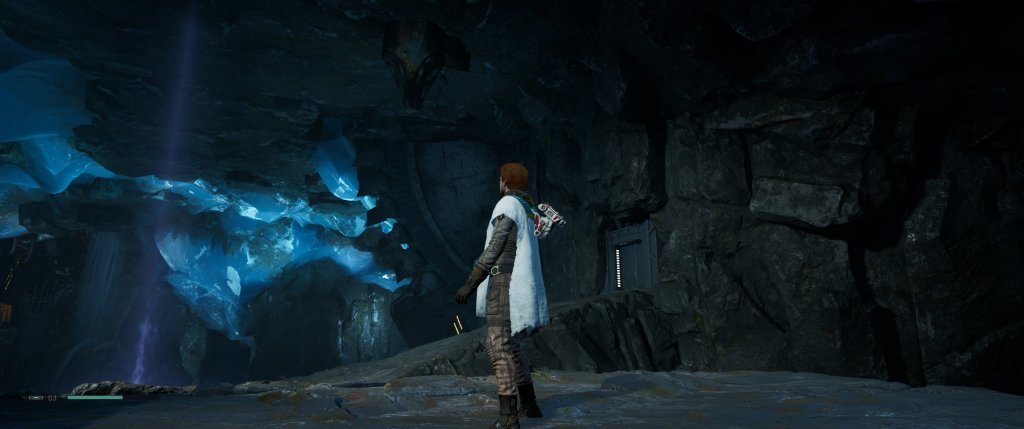
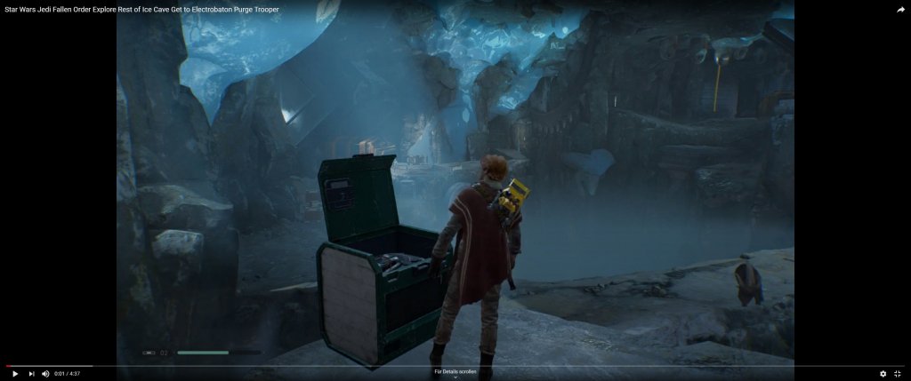
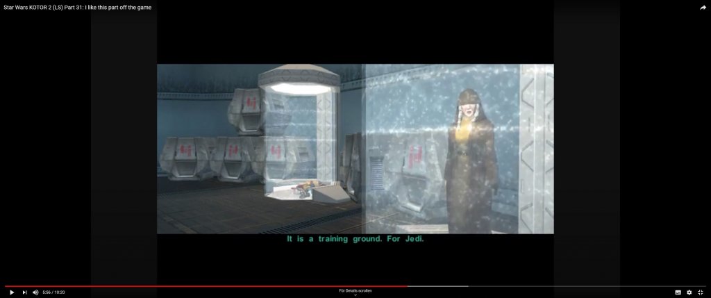
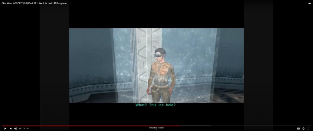
But the water needs to be transported i suppose through pipes etc with at least some sort of cold-insulation. I mean, you are at Polar region in a huge cave at probably minus 50-60 degrees, without any visible heating devices and you tell me there shouldnt be any sign of ice? Come on. Btw. dont know if i remember it correctly - but didnt Atton made a comment on how cold it is? In Jedi FO your not even near the polar region - and the cave (similar in size) looks like this: EDIT: checked the dialogue again, where Atton confirms about the icy temperatures inside the academy:
-
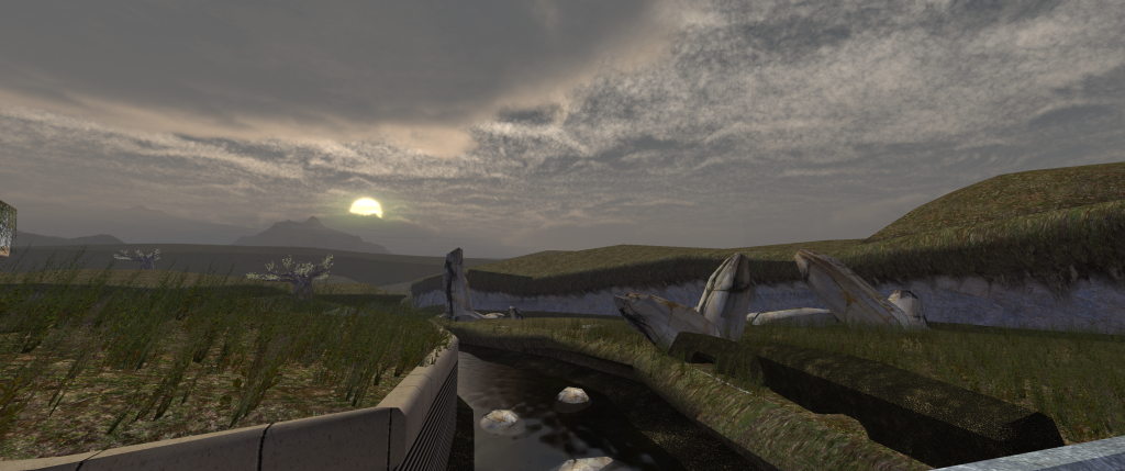
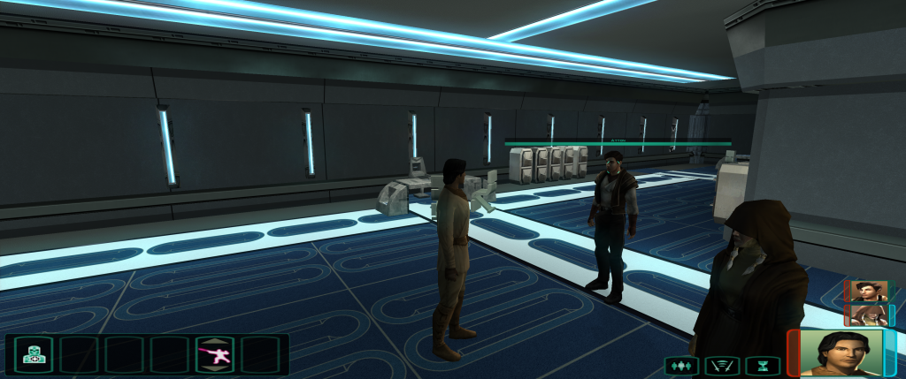
Thats true. Ive thought about it - do you know the super enhanced mod btw? It makes the game fast paced & much more intense - i remember being 1 shotted by the first droid encounter at Peragus back in the day. I think with a few adjustments e.g. setting blasterbolt deflection to 0 without lightsaber and combining by disabling the saving option (only autosaving at certain points) it would be very cool indeed. well the flag is a bit polarizing, true - but for now i did what i could so there other things that need to be finished as well. Btw, what do you guys think of making the Polar Academy with real iced walls? To enhance the feel like traveling through different climatic zones of Telos? SW electronics always have those lights to indicate operational readiness: "iced" ground/walls with slight reflections: new doors with frozen wire parts (display panel = placeholder, needs attention though) For Dantooine, created new ground tex & muddy sinkholes:
-
Thanks. Well, theroretically it should be possible to edit the FMVs though. What other aspects exactly? Visually, i try to cover at least some basic things like computer panels, Ebon Hawk model, and also those dialogue windows when you open workbench & consoles. In general, what i cant do, but Kotor would really need: are features like new cinematic camera angles during dialogues, or slo-mo finishing cutscenes during fights e.g. on critical hits etc. (Probably you could request some of those?)
-
No, i wont release a beta, it will be the complete package when its done. Yes that haunting atmosphere suits the SW Universe. The first game had its moments, no doubt but some dialogues were just childish while the second one feels more mature and better written in general. Do you know Control by chance? Great game - really crazy sometimes, but in a good way 😀 Something in between X-Files and Mass Effect. It also has that "soft horror" element which i really like, it makes the overall gameplay feeling much more intense. Edit: I hope your offer helping me out still stands btw, would be really awesome !
-
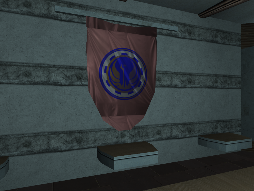
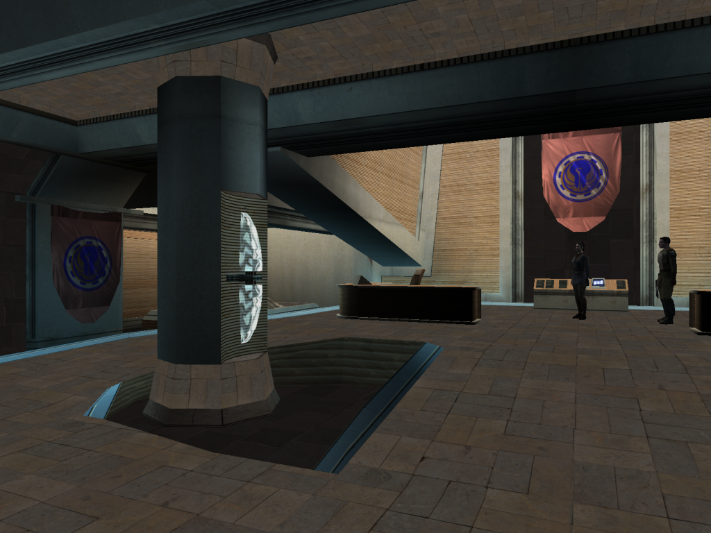
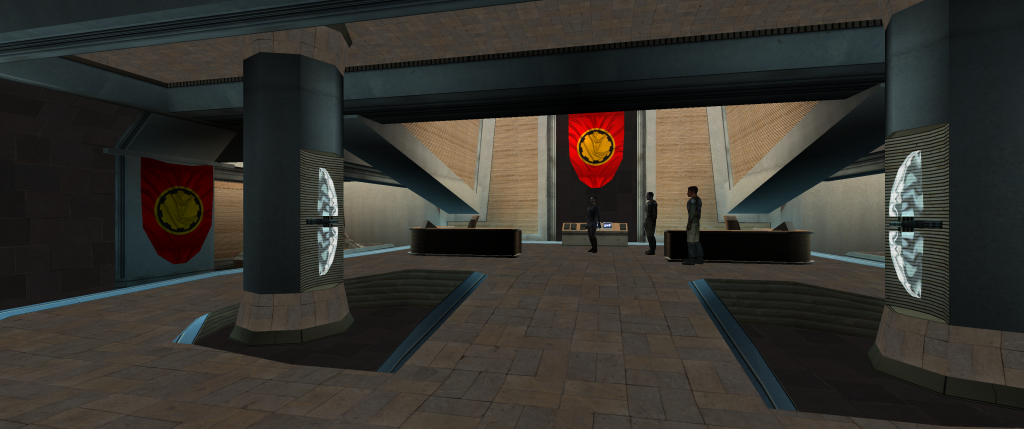
Glad you like it! Dantooine just has that special atmosphere, especially the first game! The Flag is, as @Kexikus said, quite a difficult one, because its cut into 3 pieces each with only 1 tex assigned, and also im struggling to get the logo properly distorted; anyway, here is another iteration: Made some changes to the Military Base, including some highres Concrete/ walls & getting rid of the blue tint, actually im quite happy how it turned out:
-
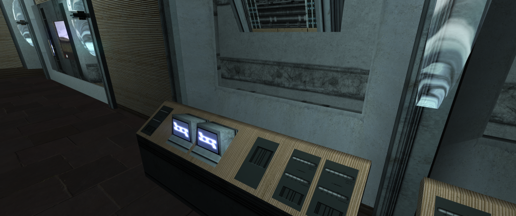
Sounds lovely -i'll get back to you in a couple days. What i could think of for example, is that we implement some of those animated panels for the Hawk (they need to be drawn by a special software but later more) http://www.blindltd.com/the-rise-of-skywalker About the military base, currently- its definitely a weak point of the project especially the walls need some treatment: i will change the computer panel on the door to something more appropriate later: Nice catch about the flag btw, havent thought about it. I tried to get a golden/black color scheme but it looks like vanilla: so heres another try soften the colors a bit and adding a republic symbol: s Yeah. Like in modern games, you cannot make every area of a huge world just look more/ less the same - like Citadel Station, Mil. Base & Secret Academy being basically identical in art design.
-
I didnt mean to be harsh either - you know, there always will be a few jerks around who only think about themselves and nothing else. To be honest, i dont care about any light or darkside points but just for being respectful, honest and appreciative with each other. So dont worry too much about it 😀 You're always welcome to help me out and im glad if you have any ideas, suggestions for feedback!
-
Nah, i dont think this is the usual reaction of approval, thats why i asked. Do you know what i think? The DS points were regarding your question about the release date! And as we both know, for obvious reasons its impossible to determine one.
-
Hmm, are those dark side points supposed to be bad? I wonder why I deserve them...
-
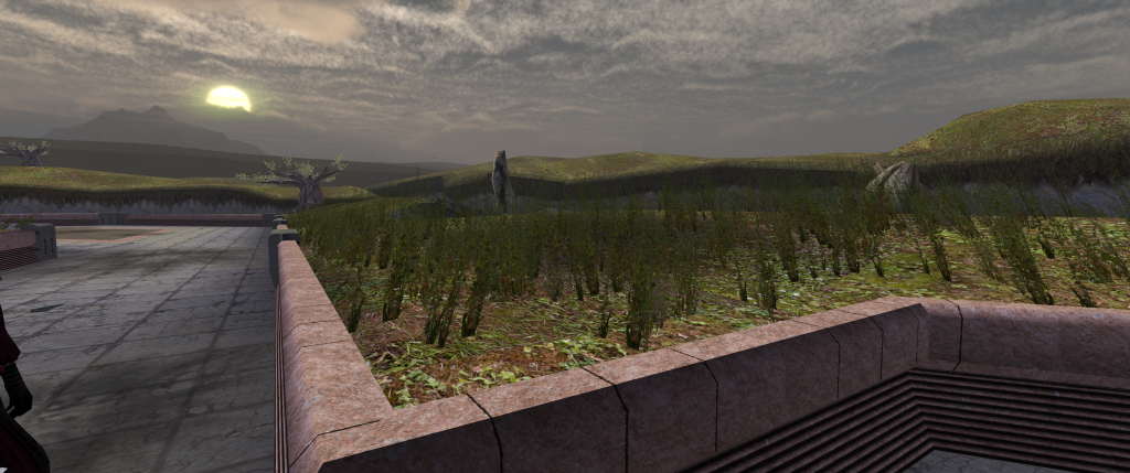
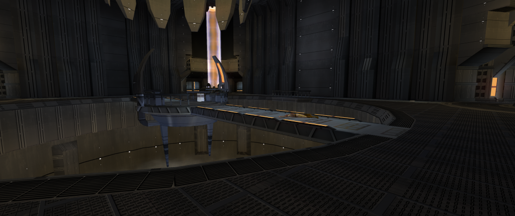
Well thanks! This is indeed a good question.. and difficult to answer ^^ What i can say, is - its making surprisingly good progress in both quality and quantity, and using e.g. UHQ nature resources recently has helped a lot actually - so, i already can see the finish, but its still some way to go. I know what you mean. But as Malkior said -especially K2 art design is not well thought and if i can achieve a better look- why not? Since those FMV only play for a few seconds anyway- but keep in mind that the game play goes on for hours & hours and its better to have those 10 sec inconsistency instead of compromises in overall visual quality . That doesn't mean I don't try to make it as canon as possible, but I try to up the color variety whenever i can, every area should look unique after all: Especially areas like Telos Military Base & Ravager look too generic in vanilla game, so I also changed the color scheme: Bare steel visible on the edges when turning the camera Countless improvements have been made for Dantooine, including 8k rock textures: WIP skybox: Animated brushed aluminum panels when turning cam: Ultra-realistic 8K grass texture: You can see the sand grain in game: New marble & windows for Onderon, shimmering in sunlight:
- 162 replies
-
- 10
-

-

-

-
-
If you want the KotOR games to look aesthetically pleasing, i think its not a good idea to mimic the "comic" look of the clone wars. As I said - the movies & newer games provide the only visually realistic references to the SW Universe and that's also the goal of this mod. Btw, it's true what Malkior said, "TSL is basically a hodgepodge of KotOR 1 textures". To understand my point, I only can encourage you to try out doing some (easy) textures for Citadel Station and then look how overused they are, then you will soon come to the conclusion that the K2 art design is everything else but thoughtfully chosen by Obsidian.
-
here you can see the mimicked texture again and its definitely not smaller than in my Kotor version: (you notice the orange texture does have different brightness in the first pic? The same effect you will have in my mod when moving the camera around ) Yes, its a huge project and i cannot tell if it will be finished, but currently its making very good progress. I understand that you guys fear that our game wont look like Kotor anymore, but to be honest with you - what makes the Kotor series so special is the storywriting, the soundtrack. Things like the area models & the general texture layout/coloring wont change - the areas should be very well recognisable after all (absolutely not like Apeiron!). However, i dont like to make sacrifices on quality - and i would, if i only use vanilla designs on textures like my previous TELOS Origins overhaul. Nice phrase, but Xuul said that a long time ago, and time 's not standing still, todays game visuals have evolved infinitely comparing to 2005. As i said before, Resident Evil 2 was a good game back then, but if you want to overhaul the visuals as good as possible and only creating a high res tex pack for it thats not enough! And you cant tell me that the new Remake is not a masterpiece. We cant do this for Kotor, but what i try to do is to create sth. in between - to mimic the visuals of todays games as textures and you know what? It feels like a Star Wars game, more than the original one.
-
i probably should send you some files to check them out directly - dont judge them too early on the screenshots... the fish screen replacement is modeled after this: (it also has that glow effect like shown here - but it changes intensity/color slightly when you turn the camera ingame). -> it feels very bright at times quite a bit like here: https://www.deviantart.com/slinker-vintage/art/KOTOR-2-Concept-Art-20187177 Honestly, im a bit suprised you guys dont seem to like the new iterations much, compared to my previous work - at least ingame - ive never done any texture work before that comes close to this overhaul qualitywise. In Vanilla Kotor, everything is in the same grey color - Peragus, Telos, Nar Shaddaa, Ravager, Ebon Hawk and even Dantooine. No differences at all. And vanilla Kotor uses the same textures like these about 20 times ingame: Dont tell me you guys want this: using the same textures over and over for every planet with only slight differences in Color/Material! With the result that you dont know if you are currently at Dantooine or Nar Shaddaa or Peragus... Remember, a 1:1 Overhaul would work fantastically with a modern game like Witcher 3 Reworked, but this is a 15 Year old game - so in absence of a proper Kotor 3 for me the best approach to handle this is to split the game in different areas and give each & every one of them a unique look but with major similarities between them like console design etc. and draw inspiration from todays ressources. During that process the vanilla art design at least for key areas should be remain untouched if possible. And honestly, Peragus just feels as it should, like an sparsely lit, abandoned mining station in the SW universe. In contrast to that, the main reactor chamber should feel more industrious, technical - in vanilla Kotor 2, its the same textures again... That sounds like some idea, however, cant get Ray Tracing run properly atm. If thats fixed, i think true emergency lighting could be used very effectively particulary on the Harbinger, where i could darken the lightmaps/ screen to almost pitch black - then the emergency lights flash only for split second - and everything goes black again... that should really intensify the haunting atmosphere there. (in contrast to this, i would do something like flickering lights at Peragus station, which indicates the low energy level but is not as radical though)
-
Glad you found the texture - what im planning to do is to give it an energy core texture that runs straight upwards (unlike the vanilla smoke tex which constantly turns counterclockwise: like the core of these energy beams here:
-
I appreciate your effort, but unfortunately its neither - when testing them, i assigned a fully transparent (empty) tex for both PER_tube & PER_tubespec; and this is what happened: Tubespec txi got any Cubemap assigned (with "blending punchthrough" in txi the pillar becomes solid black): when using "blending additive with CM_tube" always this animated "flame" appears: So this flame pillar is the only obstacle in the way right now.
-

Telos Foliage Retexture V4 - Cliff Test 1
Jorak Uln commented on Malkior's gallery image in Members Gallery
-
Nah, I checked most of the fx & PER files already. Seems I have to check files 1 by 1. That Ep1 screenshot clearly has some 90's vibe which has something to it. Once I find out which tex is involved, I'll figure something out. Mostly due to personal taste, I have to admit that vanilla kotor engine makes visuals looks too washed out in comparison to modern game engine; I tried diff. locations many times and I have to say that subtle use of reshade will help closing that gap by the use of advanced effects like SSAO & godrays; the darkening seen in screenshots don't do the actual in-game experience justice, since the bright areas remain bright. The colors pop more and the lighting feels more natural.
-
I suppose you mean Peragus? The beams are still a placeholder texture - somehow i cant find out which texture the flame-pillar inside the beams are. Since the scene (obviously Obsidian too) is inspired by this - in the end it should look a bit like the purple ones here: (if you insist on orange ones, it could be made optional: The darkening of the screen comes from reshade which is optional - personally the increased contrast via HDR effect really suits the game but that is optional as well. What i try to do is to get a bit more realistic look to the game- with peragus being a bit more gritty and e.g. Telos restoration zone buildings very weathered & rusty:
-
No i meant Telos & Peragus - those areas are almost done - the glyph textures are still ressources for unfinished areas like Dxun Temple & Korriban.
-
Hey, you noticed ^^ And it was hell of work to mimic them...btw. i intend to use them for Dxun tomb and giving Korriban assets a very similar look to Darthomir as well. and when you look at Peragus & Telos screenshots, you will notice that some tex are heavily inspired by FO/ BF2 as well, btw. what do you think about the new look?
-

Telos Foliage Retexture V4 - Cliff Test 1
Jorak Uln commented on Malkior's gallery image in Members Gallery
-
Congrats to your awesome work Alvar007! Hope there are much more to come yet😀 those custom animations greatly enhance the immersion factor so badly needed when comparing to todays standards.
-
No no my friend. There's no way it will take that long to finish. In fact , the project has taken some serious progress on both games, K1 and 2, while I haven't posted screenshots yet. The fish screen on Telos I'm afraid I've already exchanged for some in my opinion better suiting, more Star Wars like designs (still have the old file in case you guys insist on those): (Keep in mind that I might add Godrays & Ray Tracing later) I completely agree that KotOR shouldn't lose its magic, but modernizing some of its art design i feel should positively add to the immersion instead. I don't know if you have played Jedi Fallen Order yet, but it's a blast in atmosphere and I immediately found myself wish for a KotOR with those graphics... I don't want to spoil graphics yet, but here some custom designs that I use, - and there are much more not revealed yet - tell me what you guys think: some pazaak cards: Peragus (it is rich shadowed in game, but the contrast is more balanced in game:
-
Well, back then when did those 2 Telos iterations, the role model for Telos was Deus Ex Mankind Divided. However, now, there's much more inspiration to draw on at the Star Wars Universe like BF2 or Jedi Fallen Order. Also, since I wasn't totally convinced how it turned out, I decided to redo the overall design again (for the last time i hope), to sth similar to this, which is the exact way I would imagine Citadel in 2020: I respectfully disagree. I've taken a look at Halo 2 Anniversary, and while its good, i feel it could/should have been taken further. For me, if you're talking about a "perfect" overhaul = Remake. E.g. something like Resident Evil 2 Remake - which is something totally out of reach for KotOR though. What we can do is to be inspired by Games like above and make textures from scratch which is much better in my opinion than just 1:1 using the vanilla designs & colors. (if you want to see how it looks first hand i could send you some files too) ----------------- When talking about designs, I completely understand that going for non Star Wars games like Mankind Divided is not a good idea, things should feel authentic after all. That means for me you should feel your in the Star Wars universe on every corner of the game - as I said above, now i finally have enough resources to get the inspiration from to do that - a bit like the SWTOR overhaul back then but with a much greater pool of realistic designs to draw on.


