About This File
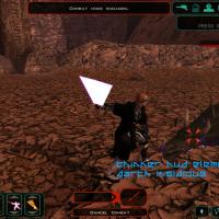
This mod makes some of the HUD elements thinner, and a bit less chunky.
The part items and powers menus have had the sides of each section cut out,
and the up and down arrows made narrower. The 'hostile' powers and items menu,
which appears above enemies, has also been thinned out in the same way.
The combat action queue has been slightly streamlined.
The combat reticle which apears over the currently-targeted enemy has been replaced.
The party's health and force power bars have also been thinned.
N.B.: This mod has only been tested at 1280x768 resolution on the PC.
It does not replace the Xbox versions of the UI,
and may not work at lower resolutions.
Installation
Just drop the files into
your Override folder.
Uninstallation
Take them out again. ![]()


Recommended Comments
Join the conversation
You can post now and register later. If you have an account, sign in now to post with your account.