-
Content Count
1,554 -
Joined
-
Last visited
-
Days Won
46
Content Type
Profiles
Forums
Blogs
Forum & Tracker Requests
Downloads
Gallery
Store
Calendar
Everything posted by Malkior
-
Yeah. I was referring to Bloodrayne, the videogame character. And, by jove you are right! I don't know how the lighting has a such a drastic difference in game, but after looking it over, I have to say that the hair fits in and the lips look alright to me. (thus making my previous comment inaccurate)Weird how actually trying it helped... As for animating textures, I have tried to find an answer to that question, but I just don't know how Aurora/the NWN engine uses them. I have recently been trying to make the sith lightning above the ritual in Freedon Nadd's tomb higher quality, but all of my attempts make it stop animating properly. Maybe someone around knows how to animate textures and could help both of us . -Edit I notice you said animated lighting, but I believe that lightmaps are used for lighting in Aurora/NWN engine and are technically textures; unless maybe it uses some code for it.
-
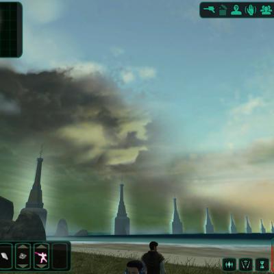
File Name: More Vibrant Skies File Submitter: Malkior File Submitted: 16 May 2012 File Category: Skins Ever wonder how it feels to run from level to level and look at nearly every sky texture border to make sure that every pixel matches?.. I sure do now. My goal was to make all of the skyboxes look more "alive" by changing certain values in photoshop to getting rid of the twilight/grey color palette that was used. The only skybox I actually repainted the entirety was dxun to make it look like the player was actually in a thunderstorm and not those grey wispy things. (there were two zones and each required their own texture) I also provided options if you don't want the moon and/or planet on the background on Dxun and two variations on the suns of Dantooine and Telos. (Also included is a small .txi file that makes the girders outside Telos Station more visible and less like paper mache`) Hopefully they make Kotor II more visually appealing than the original game did. Click here to download this file
- 1 reply
-
- 1
-

-

Would like to try a new old PC game from 2001-2006
Malkior replied to milestails's topic in General Discussion
Jedi Outcast worked on all of the PCs I've owned including my old Pentium 4. I would highly suggest it as it is still unbelievably fun to force throw stormtoopers into the ground and full dismemberment is possible with your lightsaber (if you know how to add it in the console) Also the narrative is really well done for single player. Academy is good if you like options in your single player and want to play it in any sequence you want. (I hated heck out of the story, but maybe you might dig it)-If you're into it, full dismemberment is hard to apply, but with time and google, I was able to get it to work- Half-Life 2 is one of my absolute favorites and it is still a graphics tour de force to this day. I like physics gameplay and you really can play it however you want with the grav gun. The script is also top-notch and the sound quality is quite nice. -
Version 1.0
17,672 downloads
Ever wonder how it feels to run from level to level and look at nearly every sky texture border to make sure that every pixel matches?.. I sure do now. My goal was to make all of the skyboxes look more "alive" by changing certain values in photoshop to getting rid of the twilight/grey color palette that was used. The only skybox I actually repainted the entirety was dxun to make it look like the player was actually in a thunderstorm and not those grey wispy things. (there were two zones and each required their own texture) I also provided options if you don't want the moon and/or planet on the background on Dxun and two variations on the suns of Dantooine and Telos. (Also included is a small .txi file that makes the girders outside Telos Station more visible and less like paper mache`) Hopefully they make Kotor II more visually appealing than the original game did. -
I've gotta say I really like the darkside color transition! (kinda reminds me of Bloodrayne) Although, I see what the staff meant by the hair being too colorful. It's the skin tone on the model is the wrong color for the bright red of the hair and the lips. Maybe if you darkened or desaturated the lips on the LS model a bit to make them blend more, it may be less bright? Frankly I think the hair looks convincing, but the lips may be too bright.


