Leaderboard
Popular Content
Showing content with the highest reputation on 10/27/2021 in Posts
-
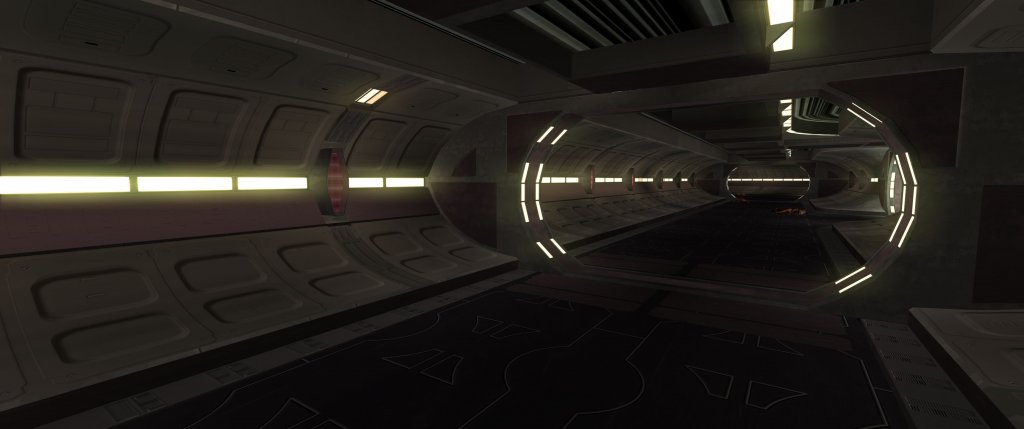
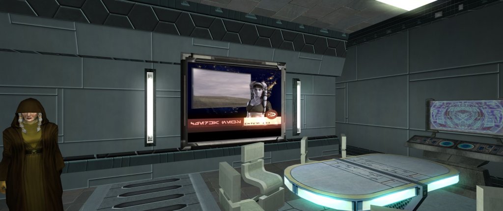
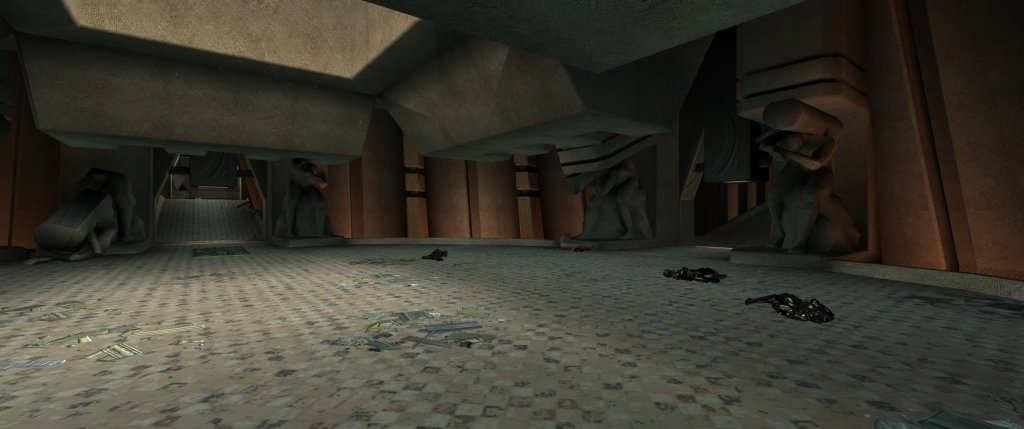
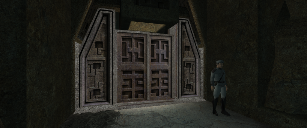
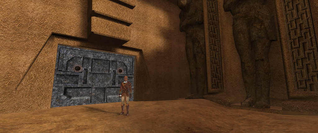
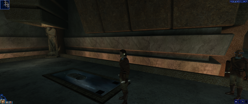
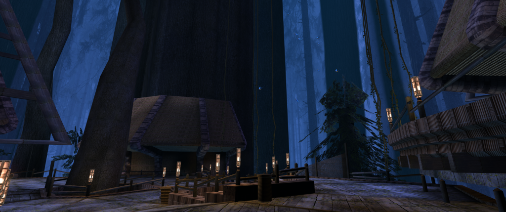
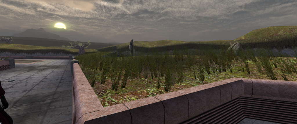
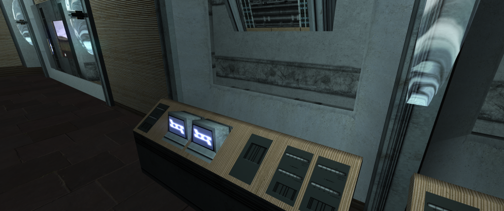
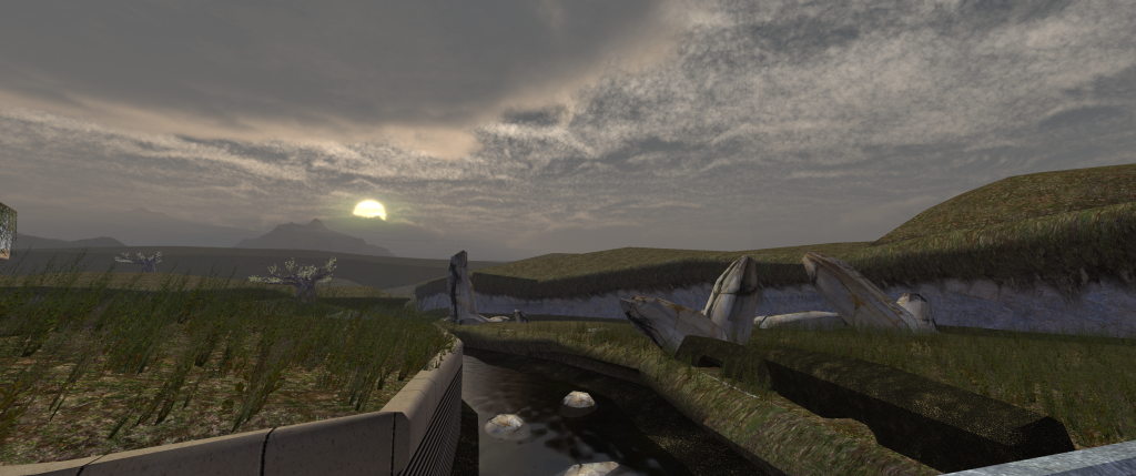
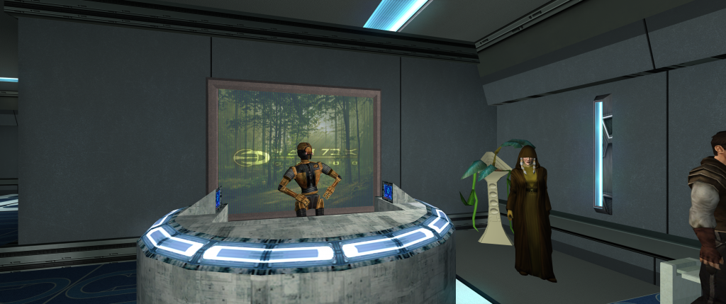
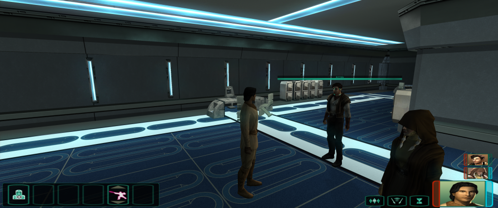
In this Topic i want to share my current progress on a project to make the visual appearance of the Planets in Kotor 2 more appealing. While learning to create textures in my previous Mods like the Complete Overhaul Series for K1, this mod is the end- product of that process over the years. The overall goal of this mod is to bring more of the movie flair to the game by emulating the panel designs of the Prequel, Sequel Trilogy and (perhaps in the future) Battlefront II. I know this is a very ambitious project so i cant tell if im able to pull it off in time, but while its already covering large parts of the game, i try to improve it, by adding some textures here and there from time to time. WIP Screenshots:1 point
-
Since this is a WIP thread for VarsityPuppet and the Chris Cornell head was posted by VarsityPuppet in this WIP thread, it can be a safe bet that Chris Cornell's head would be uploaded by VarsityPuppet. But since Chris Cornell's head hasn't yet been uploaded, a more appropriate question would be to ask @VarsityPuppet if he has any intention of uploading the Chris Cornell head.1 point
-
Here some updated screenshots - its amazes me how much graphical improvement can be made with texturing alone, although adding custom lightmaps is something thats hopefully is doable later, too. Recently created highly detailed heightmaps for a realistic look on (uneven) surfaces: Vanilla texture: recreated tex: Ingame: primarily used on Korriban: misc planets: Please give me a short feedback whether you like/dislike the new look and why.1 point
-
Thats true. Ive thought about it - do you know the super enhanced mod btw? It makes the game fast paced & much more intense - i remember being 1 shotted by the first droid encounter at Peragus back in the day. I think with a few adjustments e.g. setting blasterbolt deflection to 0 without lightsaber and combining by disabling the saving option (only autosaving at certain points) it would be very cool indeed. well the flag is a bit polarizing, true - but for now i did what i could so there other things that need to be finished as well. Btw, what do you guys think of making the Polar Academy with real iced walls? To enhance the feel like traveling through different climatic zones of Telos? SW electronics always have those lights to indicate operational readiness: "iced" ground/walls with slight reflections: new doors with frozen wire parts (display panel = placeholder, needs attention though) For Dantooine, created new ground tex & muddy sinkholes:1 point
-
Well thanks! This is indeed a good question.. and difficult to answer ^^ What i can say, is - its making surprisingly good progress in both quality and quantity, and using e.g. UHQ nature resources recently has helped a lot actually - so, i already can see the finish, but its still some way to go. I know what you mean. But as Malkior said -especially K2 art design is not well thought and if i can achieve a better look- why not? Since those FMV only play for a few seconds anyway- but keep in mind that the game play goes on for hours & hours and its better to have those 10 sec inconsistency instead of compromises in overall visual quality . That doesn't mean I don't try to make it as canon as possible, but I try to up the color variety whenever i can, every area should look unique after all: Especially areas like Telos Military Base & Ravager look too generic in vanilla game, so I also changed the color scheme: Bare steel visible on the edges when turning the camera Countless improvements have been made for Dantooine, including 8k rock textures: WIP skybox: Animated brushed aluminum panels when turning cam: Ultra-realistic 8K grass texture: You can see the sand grain in game: New marble & windows for Onderon, shimmering in sunlight:1 point
-
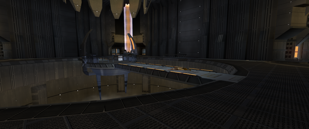
I suppose you mean Peragus? The beams are still a placeholder texture - somehow i cant find out which texture the flame-pillar inside the beams are. Since the scene (obviously Obsidian too) is inspired by this - in the end it should look a bit like the purple ones here: (if you insist on orange ones, it could be made optional: The darkening of the screen comes from reshade which is optional - personally the increased contrast via HDR effect really suits the game but that is optional as well. What i try to do is to get a bit more realistic look to the game- with peragus being a bit more gritty and e.g. Telos restoration zone buildings very weathered & rusty:1 point
-
No no my friend. There's no way it will take that long to finish. In fact , the project has taken some serious progress on both games, K1 and 2, while I haven't posted screenshots yet. The fish screen on Telos I'm afraid I've already exchanged for some in my opinion better suiting, more Star Wars like designs (still have the old file in case you guys insist on those): (Keep in mind that I might add Godrays & Ray Tracing later) I completely agree that KotOR shouldn't lose its magic, but modernizing some of its art design i feel should positively add to the immersion instead. I don't know if you have played Jedi Fallen Order yet, but it's a blast in atmosphere and I immediately found myself wish for a KotOR with those graphics... I don't want to spoil graphics yet, but here some custom designs that I use, - and there are much more not revealed yet - tell me what you guys think: some pazaak cards: Peragus (it is rich shadowed in game, but the contrast is more balanced in game:1 point
-
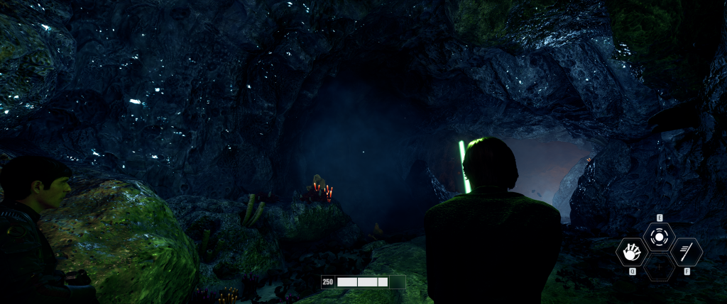
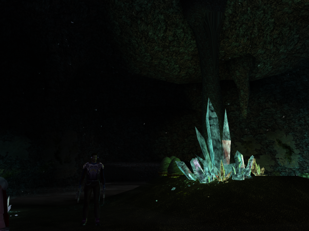
Well glad you like it! Things like wind & vegetation effects would be certainly cool but probably not possible... However, filling the skyboxes with numerous objects would simluate variety to some degree. Dantooine btw. is done with Naboo in mind: Mod: For the Crystal cave im still thinking about emulating the shimmering effect on the rocks here: Still WIP:1 point


